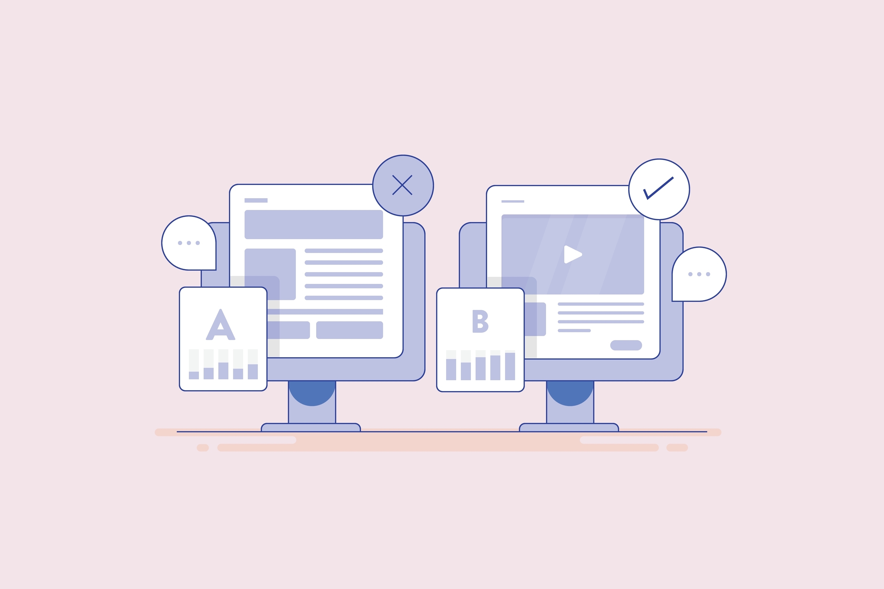
Want to meet or exceed your conversion goals? A well-designed and well-structured landing page is the best way to achieve this aim.
To help you design landing pages that will convert, here we’ve collated five of the best landing page examples from a variety of industries. On top of this, we’ve also highlighted exactly what we love about each page, certain elements that we might change and our view on how these pages could be rolled out on your website.
1. LinkedIn Jobs

At first glance, this example doesn’t look overly sexy or appealing. However, it does the subtle things very well.
For example, it includes a non-disruptive CTA in the bottom right corner, the design is clean and the tagline is simple. Added to this, the copywriting includes data-backed trust signals and the customer testimonial includes a photo, making everything feel more trustworthy.
2. Adobe

Adobe’s Creative Cloud landing page is noticeable for two reasons: the prominent influencer partnership with Billie Eilish and the creative copy on the page.
The headline is the most prominent piece of information on the page, and it succinctly explains the offer at a glance. Added to this, the surrounding copy does a really good job of showing the saving: writing the previous price and the new cost really shows the value. It’s a great piece of psychology.
Finally, the rest of the copy on the page is interesting. It uses active verbs that resonate. These are much more powerful than exclamation points.
The only thing we’d really change here is the image. It would be ‘off brand’ for Billie Eilish, but some level of excitement would probably help to sell more products. Instead, she looks uninterested and aloof. Although you could argue that’s more genuine and natural for her.
3. BairesDev

This landing page example from BairesDev (an IT contracting agency) is a case study in the power and importance of trust signals.
It contains so many different ones, including qualifiers about ‘10+ years of experience’, ‘top 1% of engineers’, the logos of Fortune 500 companies and a customer satisfaction score in excess of 90%. And that’s before we even discuss the testimonials from the likes of Salesforce, Google and Rolls Royce.
On top of this, the page does other things well, too. For example, the copy is imaginative, using clever language like ‘dream-team’, ‘talent that delivers’ and ‘jump-start your business’.
Finally, the CTA form is simple. It’s very quick to fill out and it even gives people dedicated options to choose from. This makes the process of getting in touch frictionless.
4. Powell & Sons

Next, we have this homepage from Powell & Sons, which is a masterclass in local search optimisation. It contains local keywords in the heading, the body copy, the on-page map and the meta description. Plus, none of these are spammy and the copy appears naturally written.
Added to this, rather than using stock images, the site makes use of real images, which add trust. However, admittedly, these could be a little more vibrant. That said, the photo of the owner of the business halfway down is a nice trust signal and shows homeowners who they will be working with.
Finally, the site also contains reviews with dates, showcasing that the company is completing work with happy customers right now. This is far more impactful than regurgitating reviews from old projects.
5. Freshly

Freshly is a meal-prep service that really knows how to show off its products. The company’s landing page stands out thanks to its vibrancy, which is created by the high-class imagery.
Outside of the imagery, the page also does a lot of other things well. For example, its use of informal language such as ‘top-rated faves’ speaks directly to the audience. In fact, it sounds like another person talking about the brand, rather than a brand talking about itself. This tone also carries through to the reviews, which are conversational.
Added to this, the page both starts and ends with a clear offer and CTA, which will have a positive impact on conversions. It’s also great that the CTAs are nicely branded.
Best Landing Page Examples for 2025: What Have We Learnt?
The takeaways from this will vary depending on the industry you’re in, the product or service you’re selling and the structure of your website. Some of it will also be brand dependent (for example, the Freshly tone of voice may not work for you).
However, the very best landing pages for 2025 have a lot in common. For example, they’re all:
- Clearly structured
- Easy to follow
- Focus on trust signals
- Contain well-crafted copy that speaks directly to customers
- Showcase exciting imagery
- Contain multiple CTAs and forms that are easy to fill in
Replicate any of these examples and watch your conversion rates skyrocket.


Leave a Reply